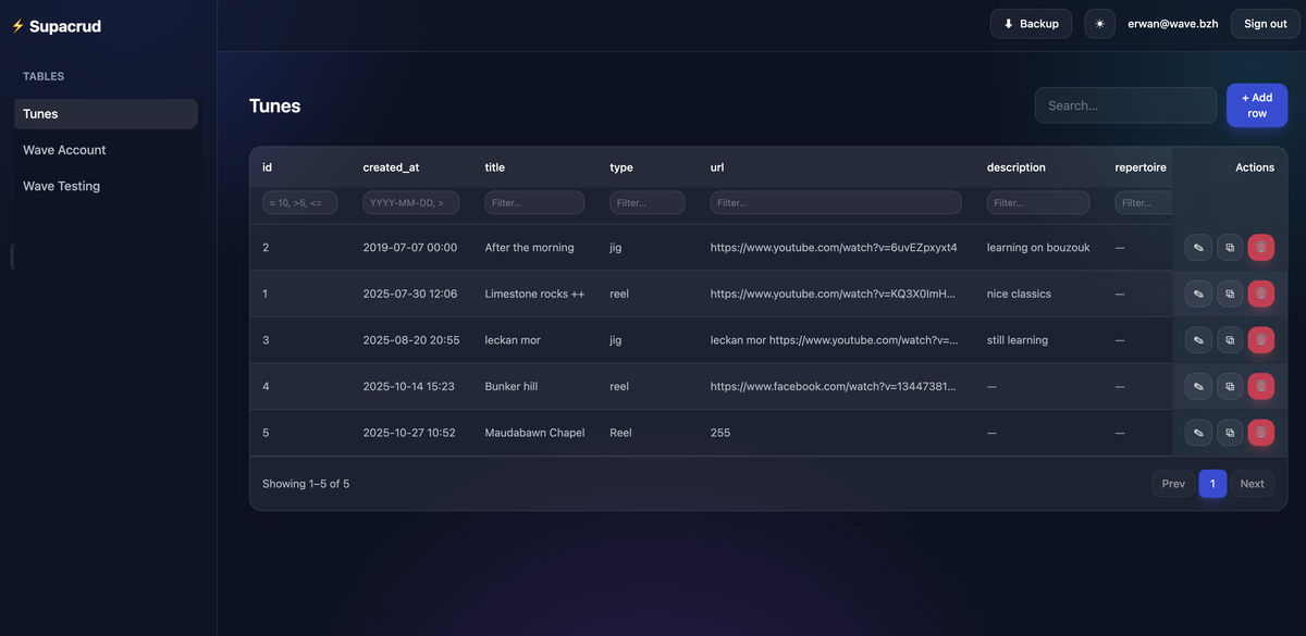
I’ve been building crud all my life, designing and developing full interface admin apps from scratch. More recently (that’s like less than 10 years ago) I stopped development and started pushing live apps on production with nova , filament , backpack, crudbooster, but that’s not enough for me, I need more. So I created a specific supabase crud app : welcome WaveSupaCrud. Delegating development and roadmap decisions to Claude Fable triggered a new era that I would call UltraHuman , I mean this guy is better than us humans.
- Why supabase
- with the free plan you can go very far. Just be careful and make regular backups from the top right menu (git actions project). When developing , especially when vibe coding with AI tools, there is a high risk of loosing data. WaveSupaCrud is a base toolkit that empowers supabase users, including free plan
- Theming Layout choice
Glass theme is in — rebuild done, 24/24 tests pass. Hard-reload the panel to see it.
What changed, visually:
- Gradient mesh background — three soft radial blobs (indigo, cyan, violet) fixed behind everything, in both modes: pastel wash over light gray in light mode, glowing accents over deep navy (
#0c1120) in dark. This is the layer that makes the blur read as actual glass.- Every panel is now frosted — cards, sidebar, and sticky header use translucent backgrounds with
backdrop-blur-xl, hairline white borders, and a softshadow-glass. The header is the best demo: scroll a long table and watch rows blur underneath it.- Component recipes updated in one place (input.css): inputs are translucent and brighten on focus, primary/danger buttons keep their solid color but gained a colored glow shadow and
rounded-xl, and there’s a new.sc-glassbarclass for chrome bars.- Sidebar flipped from solid dark to glass — active nav links are now a primary-tinted pill (
bg-primary/15 text-primary) instead of the dark TailAdmin highlight; I restructured the link colors so the active state can’t lose the CSS specificity fight against the base color.- Details: table borders became hairlines (
black/5/white/10), the confirm-modal overlay blurs the page behind it, pagination’s active page got the glow treatment, and the login divider matches.Everything still flows through the
sc-*classes and tailwind.config.js tokens, so iterating is cheap — if the blobs feel too strong/weak or you want a different accent hue, that’s a two-line tweak. Take a look and tell me what to adjust; when you’re happy with it I can commit and push the whole batch (filters + DEPENDENCIES.md + theme).the theme and layout depend on Tailwind CSS only, and even that is dev-time only. The first glassmorphism related commit shows :
- No external references in the CSS: the single
https://hit inmain.cssis thetailwindcss.comURL inside Tailwind’s license comment at the top of the compiled file — nothing is loaded from it. No@import, nourl()pointing anywhere (the favicon is an inlinedata:URI).- No Tailwind plugins (
plugins: []) — so no DaisyUI, no forms/typography plugins.- No TailAdmin package: TailAdmin was only ever a design reference; its look was reproduced as color/shadow tokens in tailwind.config.js and class recipes in input.css. Nothing from TailAdmin is installed or imported.
- No font files: the config lists
Interfirst in the font stack, but no webfont is downloaded — it renders with Inter only if the visitor’s OS has it, otherwise falls through to the system font stack. All “icons” (⚡ ☰ ☀ ☾ ⬇ ✕ 🔒 and the GitHub logo) are unicode glyphs or inline SVG.- No runtime JS for the UI: no Alpine, no Preline bundle — all interactivity is our own vanilla modules.
@supabase/supabase-jsexists in devDependencies purely as the source for the vendored data-layer bundle; it plays no role in layout or theming.So the deployed theme is exactly two committed artifacts of our own making:
styles/main.css(generated by the Tailwind CLI at dev time) and the class names in our source. A deployment could even deletenode_modulesandtailwindcssentirely and the look would be unchanged — you’d only need Tailwind again to modify the styles.